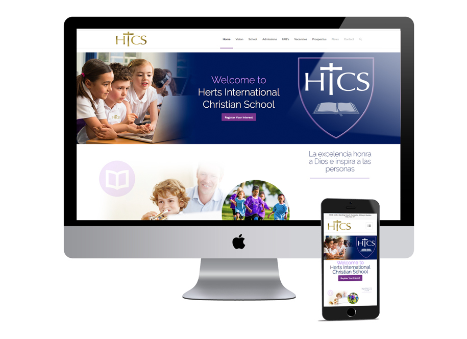
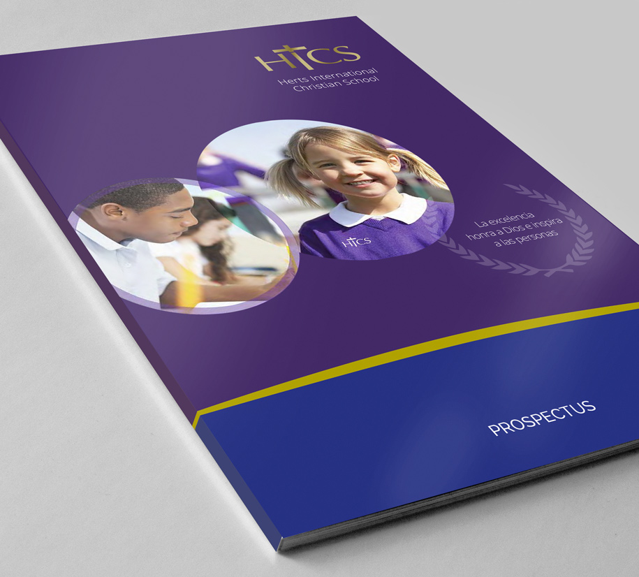
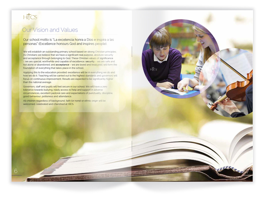
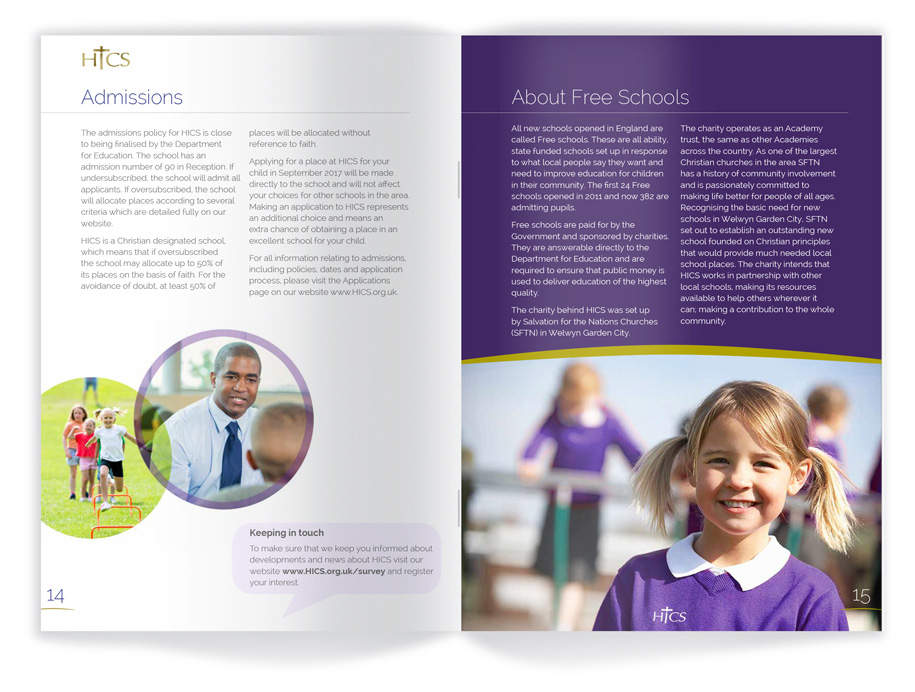
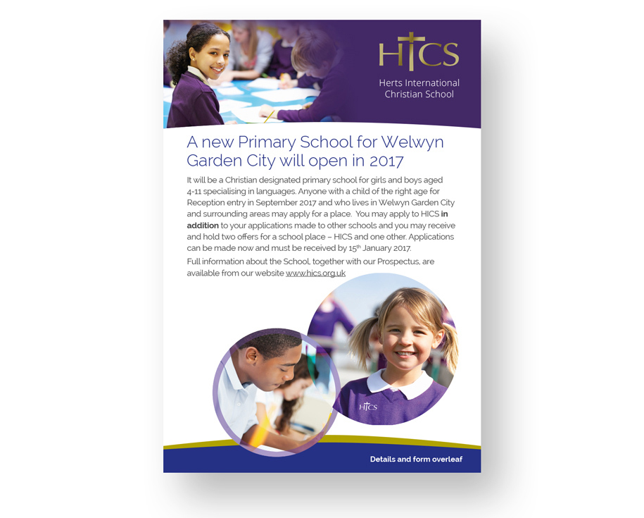
With plans to open a new primary school with a language specialisation in 2017, Red Echo Design won the tender to create a brand identity with which to begin an awareness campaign locally, that could be developed for the school opening and beyond. The existing logo was developed, a web site reskinned before embarking on the design of the school prospectus, flyers, school uniforms and email campaign graphics.
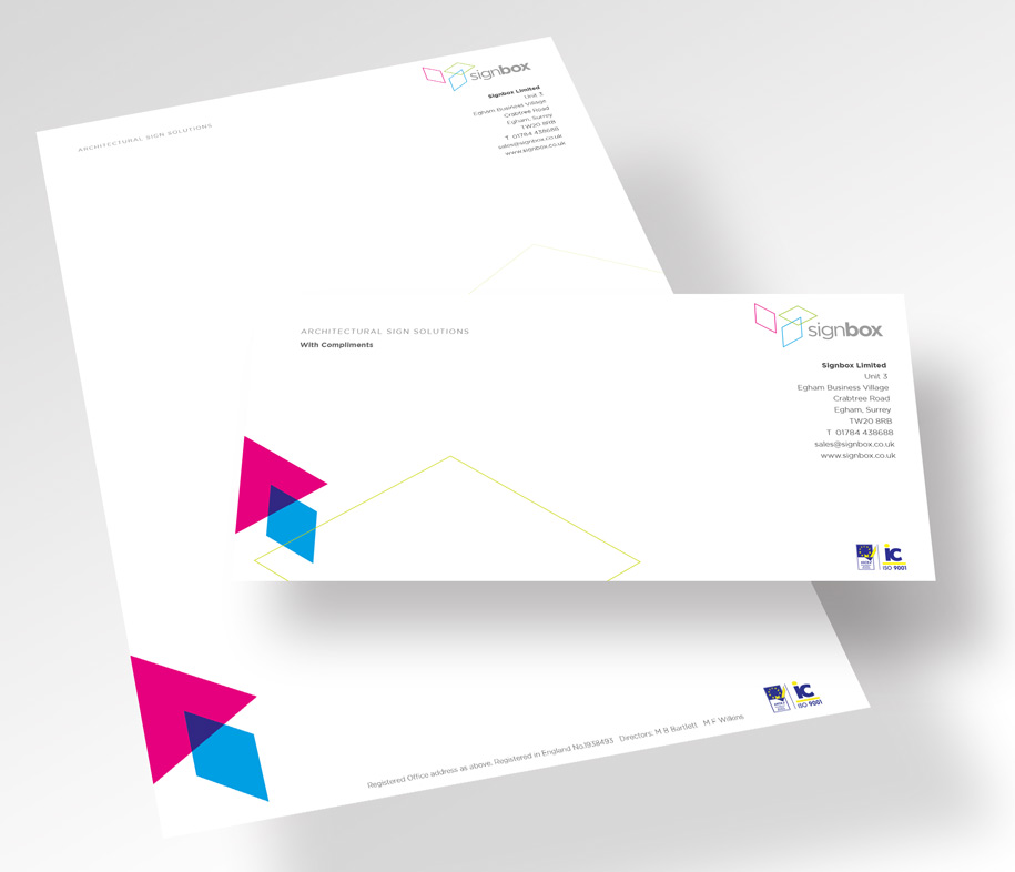
Time to roll out the new logo and identity onto all stationery items.......
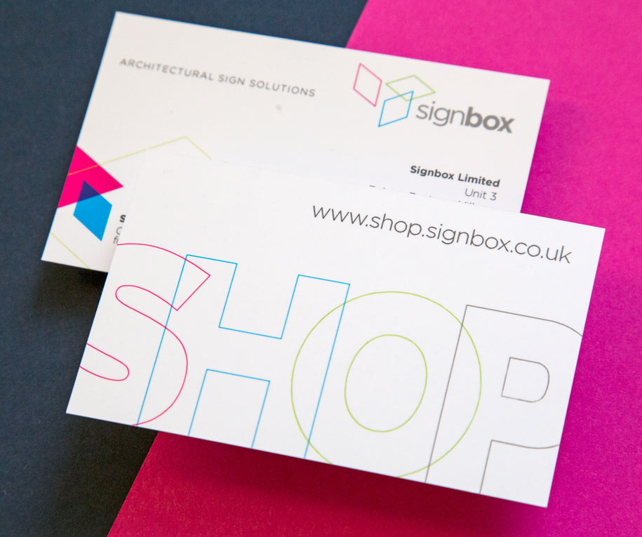
Opportunity also to advertise the relaunch of the Signbox shopsite www.shop.signbox.co.uk
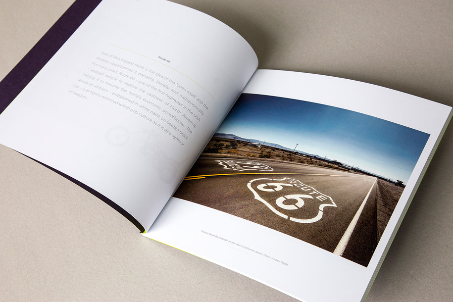
To celebrate their 30thanniversary, Signbox wanted to do something that truly conveyed why they do what they do, while simultaneously giving something back to their customers. Signbox invited their customers to submit their favourite image or sign so we could collate a landmark book. The result is 30 images and signs – one for every year Signbox has been in existence –that have helped shape the world.
Red Echo was given the envious task of creating the book bringing into play a wealth of paper and metal textures, colours, print techniques aswell as cardboard engineering.
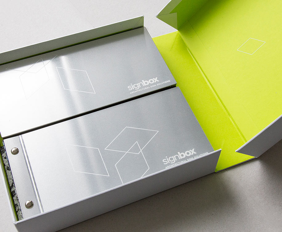
To encase the book Red echo also created a ‘Clamshell’ box to keep the book safe and give it a ‘treasured’ appeal. Nesting underneath the book snuggly were beautiful printed samples of the, graphics and imagery to showcase the capabilities and extensive finishes that Signbox had at their fingertips.
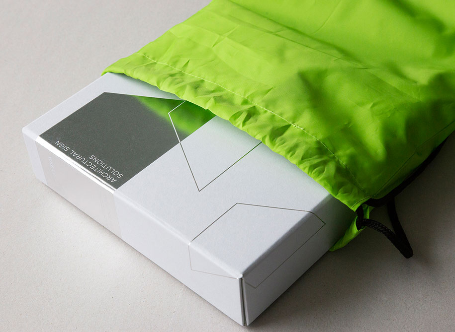
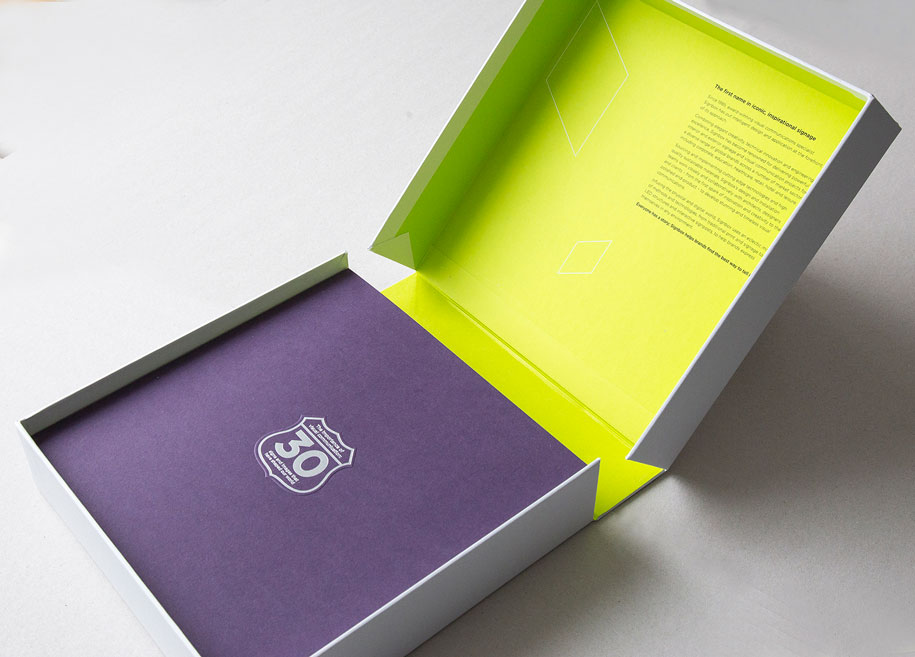
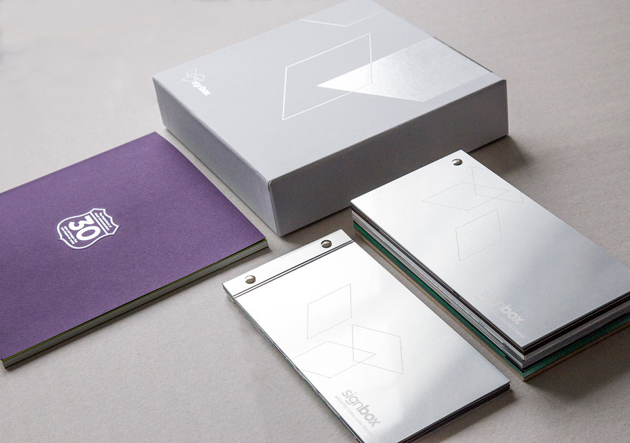
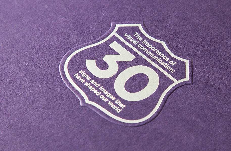
We have helped Signbox mark 30 years of creating beautiful signage in various sectors with an evolved simplified and sophisticated Logo and Identity together with an extremely keepable book and sample pack.
This evolved identity is being rolled out onto various touchpoints including stationery, building illuminated signage, website and vehicle livery. It was deemed that the outgoing logo had represented Signbox well for nearly four years, but the evolved ‘finer’ solution represents Signbox presently and into the future.
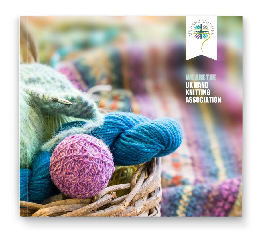
The UK Hand Knitting Association (UKHKA) is a not-for-profit organisation dedicated to promoting hand knitting and associated yarn crafts. They have developed a nationwide network of volunteers who pass on their skills to encourage newcomers to learn to knit or crochet at craft shows and other events across the UK.
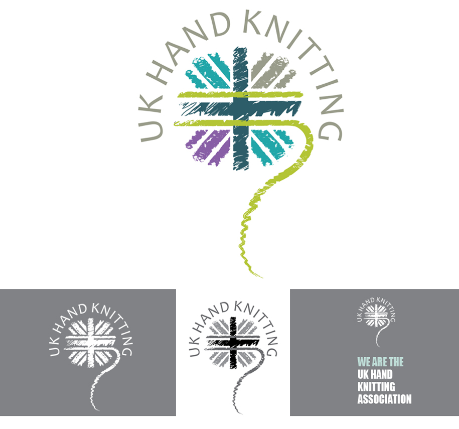
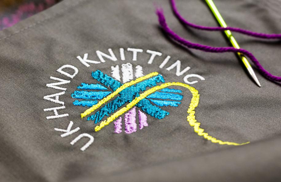
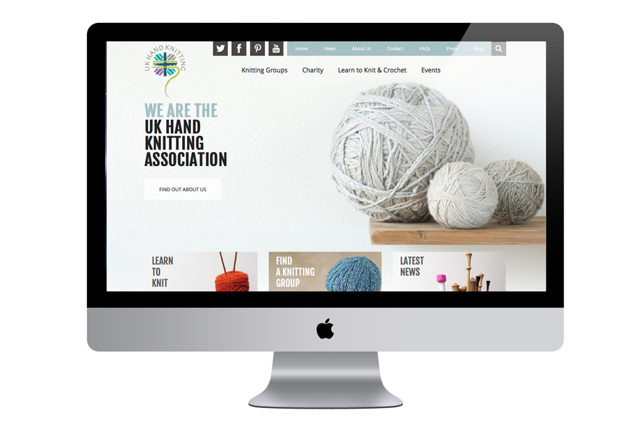
Together with Bluebear, Red Echo devised a new logo which depicted The UKHKA as a contemporary and active Association with it’s roots firmly in the UK. The introduction of modern complementary colours and a suggestion of the Union Jack design helped create a distinctive image. The feel of the identity was then introduced to the UKHKA website by Bluebear.
Stevenage based Mint Letting came to Red Echo to conjure an Identity for them that gave them just a bit of a difference from the other property faces in Hertfordshire. The solution that Mint adopted shown below expressed the vibrancy of the company with eyecatching colours and graphics. The initial Purple Letting solution was extended to 'Sales' and 'Management' with the use of different colourways.


Following the NHS shift from PCTs to a structure operating with Clinical Commissioning Groups and Customer Support Units Red Echo was invited to design and implement a new identity. The project include logo, website, business forms, annual report, information leaflets, 48 sheet hoardings, signage and signage panels.
